

During my time as a consultant, I often had to adapt my CV to the role to be filled in the client's company.
My consultancy provided a Word template with a beautiful layout that constantly got in my way: inexplicable spaces, design elements that suddenly shifted without any identifiable reason, and other frustrating challenges that wasted time to correct.
Why React and CSS?
A resume is usually a one or two-page document that describes a person's professional history, education, and qualifications.
When it comes to formatting, Google lists the following basics:
- Simple and consistent design, font, sizing, and spacing
- Use of black or dark, readable ink
- Exported as a PDF
Consistency can be achieved with reusable React components that share the same styling rules. Instead of copy-pasting formatted text, React components separate content from design and can apply conditional logic based on the input.
The resume can also be easily localized to export it in different languages or target different markets (e.g., international vs. domestic).
CSS provides full control over styling the printable page and its components. It's technology every frontend/fullstack developer is familiar with, significantly flattening the learning curve.
A modern setup with Vite or Next.js provides automatic hot reload out of the box, so every change is presented immediately in your browser.
The resume can be exported to PDF either manually through the browser's print dialog, or automatically using tools like Playwright for a scriptable, CI/CD-friendly workflow.
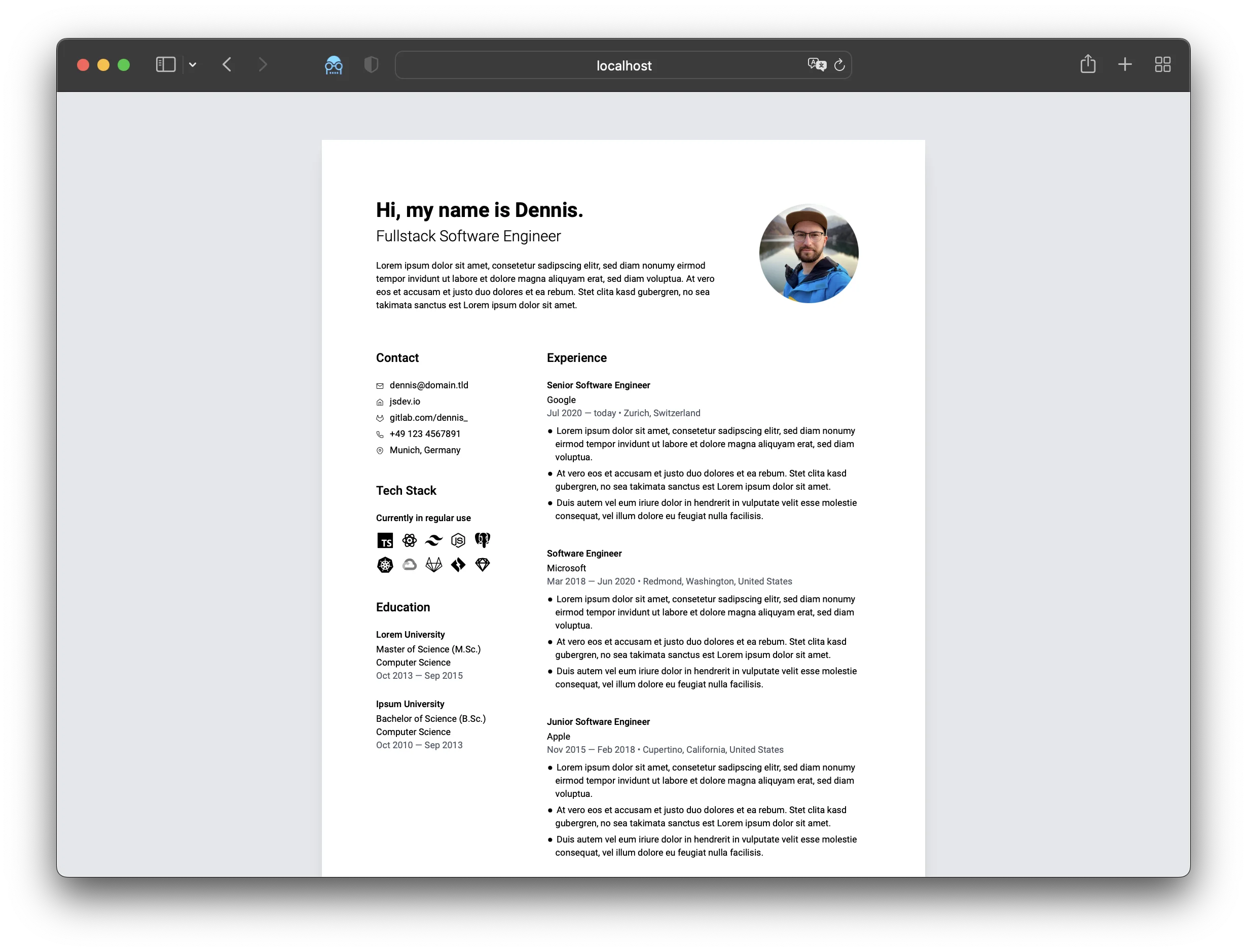
Try the live demo: View the example resume →
Print CSS Fundamentals
@media print
CSS provides a media query to adjust styles specifically for printing:
@media print {
    /* Hide screen-only elements */
    .no-print {
        display: none !important;
    }

    /* Remove margins from body */
    body {
        margin: 0;
        padding: 0;
    }

    /* Ensure colors print correctly */
    * {
        print-color-adjust: exact;
        -webkit-print-color-adjust: exact;
    }

    /* Prevent orphans and widows */
    p,
    li {
        orphans: 3;
        widows: 3;
    }
}
This is the standard way to remove navigation bars, adjust spacing, and optimize the layout for printing.
@page
The @page rule controls page-specific properties like size, orientation, and margins. It supports pseudo-classes like :first to target specific pages.
Note that @page has limited CSS property support (margins, orphans, widows, and page breaks only).
@page {
    size: A4 portrait;
    margin: 0; /* Remove default browser margins */
}
The key difference: @media print applies to the entire document, while @page controls individual page properties.
Screen Preview Setup
The React app displays pages that match the exact dimensions of a DIN A4 page (210mm × 297mm). This serves as a live preview of what the printed page will look like.
Create a page container that matches print dimensions while providing a nice preview experience:
@media screen {
    .page-container {
        width: 210mm; /* DIN A4 width */
        min-height: 297mm; /* DIN A4 height */
        margin: 20px auto;
        padding: 20mm;
        background: white;
        box-shadow: 0 2px 8px rgba(0, 0, 0, 0.1);
    }

    /* Space between multiple pages */
    .page-container + .page-container {
        margin-top: 20px;
    }
}

@media print {
    .page-container {
        width: 210mm;
        height: 297mm;
        margin: 0;
        padding: 20mm;
        page-break-after: always;
    }

    /* Don't force break after last page */
    .page-container:last-child {
        page-break-after: auto;
    }
}
Building Components
Create reusable components for repeated elements like education entries, work experience, and contact information.
Education Component Example
<Education
    school="Technical University Munich"
    degree="Master of Science (M.Sc.)"
    major="Computer Science"
    timeframe="Oct 2013 – Sep 2015"
/>
This abstracts the layout and styling, letting you focus on the data. Here's a modern TypeScript implementation:
interface EducationProps {
    school: string
    degree?: string
    major?: string
    timeframe?: string
}

function Education({ school, degree, major, timeframe }: EducationProps) {
    return (
        <div className="mb-4">
            <h4 className="text-lg font-semibold">{school}</h4>
            {(degree || major || timeframe) && (
                <div className="mt-1 space-y-0.5">
                    {degree && (
                        <p className="text-sm text-gray-700">{degree}</p>
                    )}
                    {major && <p className="text-sm text-gray-700">{major}</p>}
                    {timeframe && (
                        <p className="text-sm text-gray-600">{timeframe}</p>
                    )}
                </div>
            )}
        </div>
    )
}
Now all className updates happen in one place, ensuring consistency across all education items.
Handling Page Breaks
Page breaks are one of the most challenging aspects of print CSS. Here's how to handle them effectively:
@media print {
    /* Prevent page breaks inside these elements */
    .experience-item,
    .education-item {
        break-inside: avoid;
        page-break-inside: avoid; /* Legacy support */
    }

    /* Prevent breaking after headings */
    h1,
    h2,
    h3,
    h4,
    h5,
    h6 {
        break-after: avoid;
        page-break-after: avoid;
    }
}
Important caveat: break-inside: avoid only works if the content fits on a single page. For large sections, manually control page breaks using explicit page containers as shown in the Screen Preview Setup section.
Advanced Print Techniques
Hiding Browser Headers and Footers
By default, browsers add headers and footers with the URL, date, and page numbers when printing. While these can be disabled in print settings, you can also use CSS to push them outside the printable area:
@page {
    size: A4 portrait;
    margin: 0; /* Remove page margins where headers/footers appear */
}

@media print {
    .page-container {
        width: 100%;
        padding: 20mm 20mm 0 20mm; /* Move margins to content */
        box-sizing: border-box; /* Include padding in width */
        min-height: 100vh;
        page-break-after: always;
    }

    .page-container:last-child {
        padding-bottom: 20mm;
        page-break-after: auto;
    }
}
How it works:
@page { margin: 0; }eliminates the space where browsers render headers/footers- Padding on
.page-containercreates the same visual margins but inside the content area box-sizing: border-boxensures padding is included in the 100% width calculationmin-height: 100vhensures each container takes a full page
Important caveats:
- This CSS technique works better in Chrome than Safari, and isn't 100% bulletproof across all browsers
- Users still need to disable "Print headers and footers" in their browser's print dialog for guaranteed removal
- Browser inconsistencies in handling print CSS are exactly why automated solutions like Playwright (covered below) can provide more reliable, consistent results
Multi-Page Layouts
For resumes spanning multiple pages, create separate containers for each page to ensure precise control over content distribution:
export default function ResumePage() {
    return (
        <div className="resume-wrapper">
            {/* Page 1 */}
            <div className="page-container">
                <header>{/* ... */}</header>
                <section>{/* Summary */}</section>
                <section>{/* Experience */}</section>
                <section>{/* Education */}</section>
            </div>

            {/* Page 2 */}
            <div className="page-container">
                <section>{/* Skills */}</section>
                <section>{/* Projects */}</section>
                <section>{/* Certifications */}</section>
            </div>
        </div>
    )
}
With corresponding CSS:
@media screen {
    .page-container {
        width: 210mm;
        height: 297mm; /* Fixed height prevents overflow */
        margin: 0 auto 20px;
        padding: 20mm;
        background: white;
        overflow: hidden; /* Hide content that doesn't fit */
    }
}
This approach ensures:
- Accurate preview: What you see on screen matches the printed output
- No surprises: Content won't unexpectedly flow to new pages
- Full control: You decide exactly what goes on each page
Hiding Site Elements in Print
Use the .no-print class to hide navigation, footers, and other screen-only elements:
// Add to site footer or navigation
<footer className="no-print">{/* Footer content */}</footer>
@media print {
.no-print {
display: none !important;
}
}Overriding Dark Themes for Print
If your site uses a dark theme, force white backgrounds in print mode:
@media print {
    * {
        background: white !important;
    }

    body {
        background: white !important;
    }

    .page-container {
        background: white !important;
    }
}
The !important flag ensures these styles override any theme classes from CSS frameworks like Tailwind.
Automated PDF Generation with Playwright
While the browser's print dialog works fine for manual exports, Playwright enables scriptable, automated PDF generation—perfect for CI/CD pipelines or batch processing.
Setup
npm install -D playwrightGenerate PDF Script
// scripts/generate-resume-pdf.ts
import { chromium } from 'playwright'

async function generateResumePDF() {
    const browser = await chromium.launch()
    const page = await browser.newPage()

    // Navigate to your resume page
    await page.goto('http://localhost:3000/examples/resume', {
        waitUntil: 'networkidle'
    })

    // Generate PDF
    await page.pdf({
        path: 'resume.pdf',
        format: 'A4',
        printBackground: true,
        margin: {
            top: 0,
            right: 0,
            bottom: 0,
            left: 0
        }
    })

    await browser.close()
    console.log('✓ PDF generated: resume.pdf')
}

generateResumePDF()
Add to package.json
{
    "scripts": {
        "generate:pdf": "tsx scripts/generate-resume-pdf.ts"
    }
}
Now you can generate PDFs with a single command:
npm run generate:pdfThis approach enables version-controlled resumes, automated generation in CI/CD, and easy customization for different job applications.
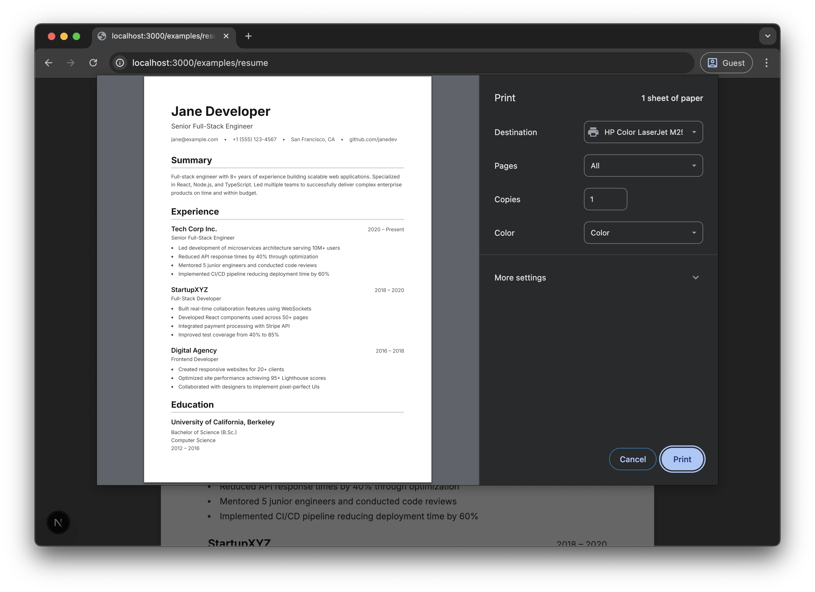
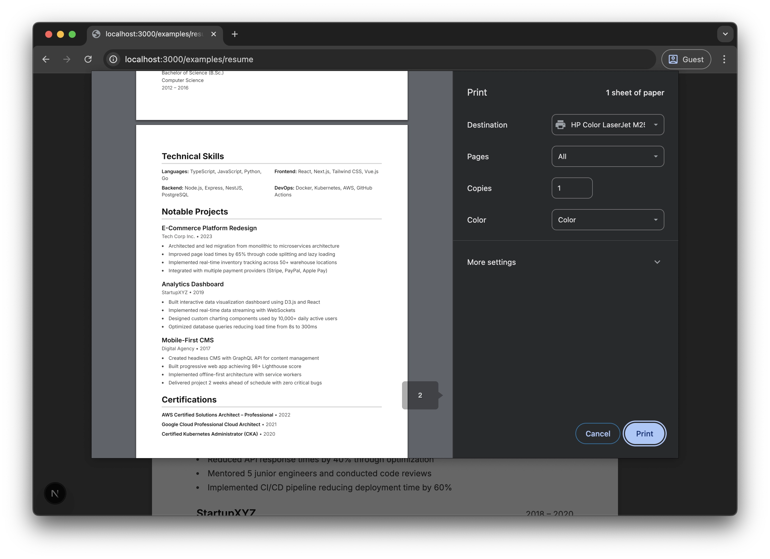
Manual Print Preview
If you prefer the browser's print dialog, the preview matches exactly what you see on screen:
Conclusion
Building your resume with React, Tailwind CSS, and Playwright provides:
- Full creative control with CSS and Tailwind
- Component reusability for consistent styling
- Version control through Git
- Automated PDF generation for CI/CD pipelines
- Easy customization for different audiences
- Live preview with hot reload during development
While it requires initial setup, this approach pays dividends for anyone who regularly updates their resume or maintains multiple variations. The combination of React's component model, CSS's print capabilities, and Playwright's automation creates a powerful, professional workflow.